Version 4.0 of the VLO was released last week, and one of the primary (and probably most eye-catching) changes is the major user interface overhaul that has been carried out since the previous release. Although the look and feel of CLARIN's central metadata search hub have changed significantly, we hope that it will still feel familiar to the regular visitor while being at least as easy to work with for the novice user as well. The familiarity of the overall application should increase over time, as this version of the is the first CLARIN application to which the newly developed common style for web sites and applications has been applied. This style, which can be considered an evolution of the styles already present in the Virtual Collection Registry, Component Registry and Centre Registry but with more consistent usage of colours, fonts and other user interface aspects, was developed in the context of CLARIN-PLUS in conjunction with a human interface guidelines document. In addition to providing a clean, modern and recognisable look and feel, an important aim of these efforts is to provide better usability across devices, including smartphones and tablets, and improved accessibility to visually impaired users. Soon other parts of CLARIN's central infrastructure will adopt the style and human interface guidelines, in the short term at least the Virtual Collection Registry and the clarin.eu website.

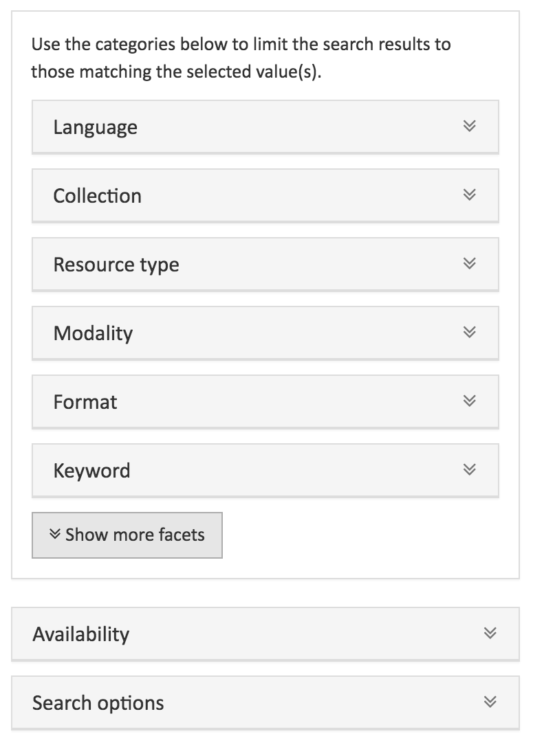
Looking at the changes in the interface of the VLO, the first thing that strikes the attention is the cleaner and less cluttered opening page. Users can enter one or more search terms straight away or, if they prefer to browse through the full set of results, either press the 'See all records' button or simply scroll down to cause the search results and facet menu to appear. To start with the latter, compared to the previous version of the VLO fewer facets are now shown initially. Some of the less commonly used facets (such as 'genre', 'country' and 'organisation') are hidden at first, but can easily be made visible using the 'show more facets' button. The search results are presented in a way quite similar to that of the older versions of the VLO, albeit slightly less visually 'compressed' and now including icons to indicate the types of resources linked from each result and how many of each, which makes it easy to see what each record has to offer at a single glance. These icons appear in the same area that contains the familiar license and availability icons.

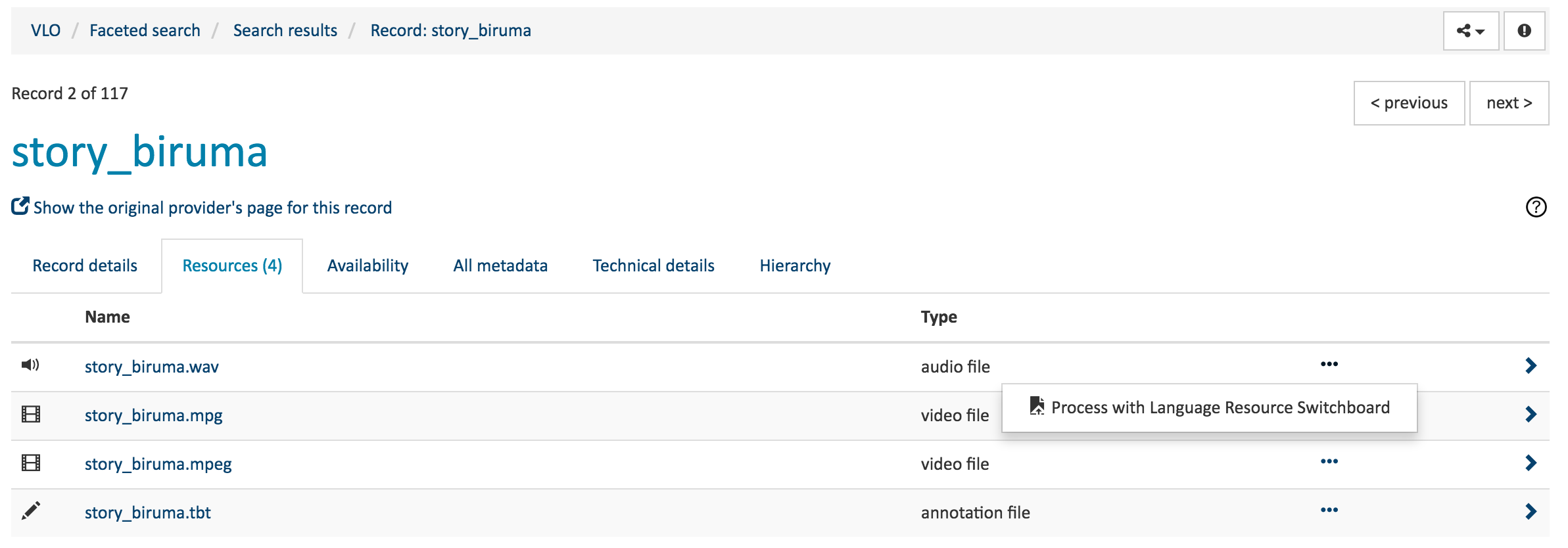
Clicking one of these icons, the search result's title or the name of one of the resources in the expanded state of a search result will lead to the "record page" of that particular result. The most apparent change in this part of the VLO is the organisation into tabs. This makes it easy to navigate the various aspects of a record in the VLO: the record details (i.e. the values for the various common fields known to the VLO), the resources, availability and licence information, technical details and full metadata content ('all metadata'). The resources (accessible via the second tab) are now displayed in a compact table with the option to expand individual resources to see more details. It also has an option menu for each resource, which contains the option to process the associated resource via the Language Resource Switchboard, a new component developed in the context of CLARIN-PLUS that serves to connect a multitude of search and processing from within the CLARIN infrastructure and will be formally introduced later this year. Many records contain an additional tab, 'hierarchy', that shows a record's hierarchical relation to other records, presented as a tree.The presence of this tab depends on the presence of a metadata hierarchy that is properly represented in the records provided to the VLO.

Another change that visitors that have used the VLO before may notice, is the somewhat altered way the 'breadcrumbs bar' works. The breadcrumbs bar is the small box that appears on the search and record pages and shows the trail of actions that have lead to the information currently displayed by the VLO. Previously, this component included a mechanism to unselect parts of the search query, which was a useful feature but could also cause a cluttered appearance and complicate the breadcrumbs functionality. The various query components (search terms and facet value selections) now appear directly above the search results, together with buttons to remove any of these from the current search. To go back to the search results from a record page, or to a 'fresh' search interface without a query, the user can simply select the corresponding step in the breadcrumb bar at any point.
 The new version of the VLO has been designed with usage on mobile devices such as smartphones and tablets in mind. On narrow screens, the layout adapts and becomes more vertically oriented, and some elements become more compact. For example, the visibility of the panel with facets and search options can be toggled on smaller screens.
In addition to the changes described thus far, which are clearly visible to the end user, this version of the VLO has a major change 'under the hood' as well: it is one of the first applications in the CLARIN infrastructure to support CMDI 1.2, the new version of CLARIN's metadata framework which was released very recently and provides many new features aimed at improving the quality of metadata and the way it can be presented in editors, viewers and catalogues. More information about CMDI 1.2 and what it can do for users, metadata providers and developers will become available soon on the CLARIN website.
We would very much like to hear from you what you think about the new version of the VLO, how well it works on your devices, your experiences with respect to accessibility, and how you think it may be improved. So please feel free to leave a message below this post or send your feedback to vlo [at] clarin.eu (vlo[at]clarin[dot]eu)!